Yello
Yello is an event management and CRM tool for campus and professional recruiting.
Role: Senior Product Designer (Feb. 2018 - Present)
I work on a team of 3 full stack product designers. We own the entire design lifecycle from user research (customer calls, onsite interviews, and usability testing) to visual design, prototyping, dev handoff, and QA.
Switching Yello’s product team to Figma
When I joined Yello, the designers and product teams were using Sketch files synced to Google Drive for designs, InVision for prototyping, and other tools and manual processes to keep everyone in sync. It worked, but there was a better solution.
Having used Figma for at least a year before this point, I knew it would be an amazing tool we could use for managing our component library, collaborating with PMs and engineers, and also each other.
My goal was to reduce friction between designers, PMs and engineers with Figma's commenting and live Jira embed features, reduce the time needed to go from design to prototype by eliminating the need to use InVision, and increase collaboration among designers by leveraging Figma's nature of being in the cloud and having multiplayer (more than one designer can work in the same file at the same time) and observation mode (you can click on someone's avatar to see what they're viewing/designing).
I mapped a few of Yello's high level design and process needs before and after the switch so you can see the benefits:
Because the team was already deep into Sketch and InVision, to make it easier for others to explore the tool for new design work, I recreated the majority of the team’s existing Sketch components in Figma in my spare time. These included modals, toasts, flyouts, colors, buttons, tooltips, tables, navigation, icons, form elements, UI controls, tags, empty states, and typography.
Reflecting on my 1st year at @Yello, my fav project wasn't working on new features. It was actually driving the switch from Sketch/Invision to @figmadesign, teaching 40 PMs, designers, and engineers along the way how to better collaborate. For that, I got the award "Figmatic" 🙃 pic.twitter.com/nHEbRPHeVg
— Trucy Phan (@trucy) December 13, 2018
The process for switching over took about 6 months for all 4 teams, and also involved creating workshops for PMs, engineers and designers to learn the tool through on-hands projects, and writing resources on Confluence.
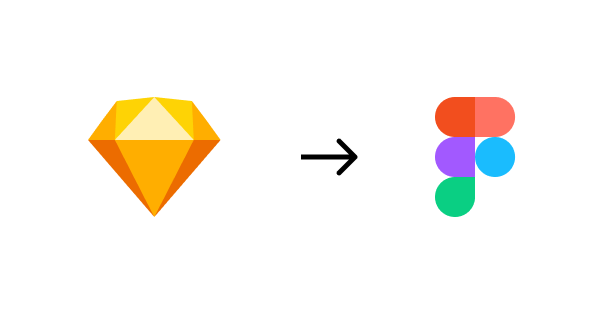
I also sent a survey asking PMs, engineers, and designers for feedback on the tool. Some interesting learnings include: not as many engineers as I thought were leaving comments in files, designers wanted wireframe components, and the tool's role in improving collaboration was perceived differently across teams.
Based on actionable feedback from the survey, I designed and added wireframe components to our team library, held an engineer-tailored workshop, and created a #figma-questions channel on Slack because people had more questions than I thought they would in that workshop!
Although this wasn't straight up product design, it has been one of my most favorite accomplishments working at Yello.
Unifying Yello's UI
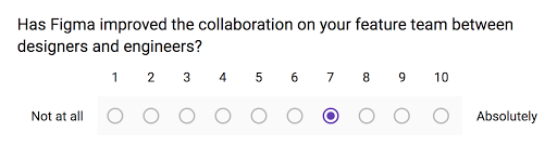
Inheriting a limited color palette that was inaccessible and lacking the range for various design needs, I set about creating a new color palette.
I began with a neutral base set, a primary accent set, as well as your standard warning, success, and error colors. Each color at level 700 was designed to address accessibility concerns and meet AA standards (in many cases, AAA was met).
Accessibile combinations
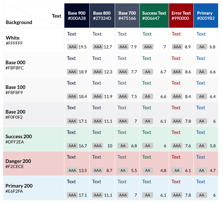
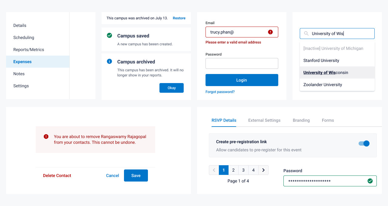
I designed the colors to work as text, backgrounds, buttons, hover states, border colors, and more. I thought in pairs and in sets, and aimed to make it accessible but still expressive. Here are a few examples of components with my color system applied.
A set of core UI components
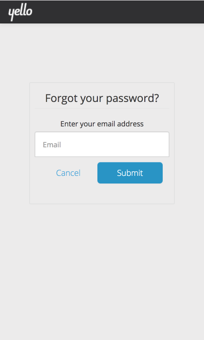
Before:
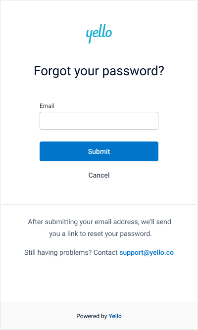
After:
Campus Recruiting
When I joined Yello, I was put on the campus recruiting team to pair with an existing product designer.
Together, we spoke with customers and internal stakeholders to determine what kinds of information would be valuable to put on this page (we called it "campus profiles").
Our methodologies were varied -- sometimes we sent surveys, sometimes we showed prototypes, and sometimes we just asked customers questions over the phone. I used Airtable to compile and tag feedback, and also share it internally to remind myself what users valued.
Although users wanted many things, our ultimate goal was to create an MVP of a campus profile where university recruiting teams could house information about a school, view their expenses incurred and ROI based on students hired, and manage staff and contacts associated with that school.
Although this project was massive, I'll just show iterations of one of the tabs -- contacts:
Explorations of Campus Contacts
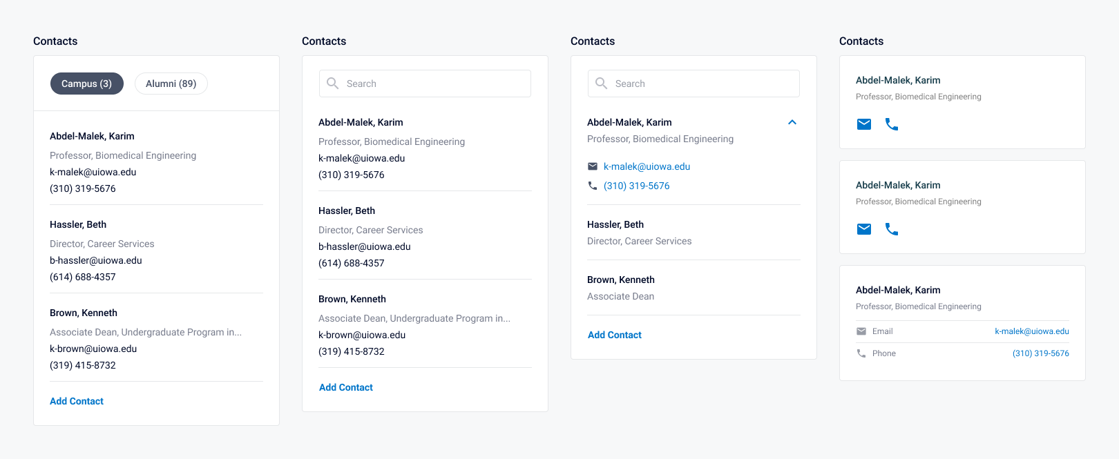
I considered inline editing, condensed views of contacts that felt like too much clicking (prototype), the concept of adding multiple contacts at a time with "Save and add another", and debating if we should support features like custom tags on contacts or the concept of staff roles. Here are a few iterations of viewing contacts.
Ultimately, after learning that recruiters wanted to manage multiple types of "people" associated with a school, I felt like it made more sense to put them in a table on a tab called "Contacts" instead of having "people" living in multiple tabs. We also had additional insight that contacts are people you might want to email in bulk -- not just view -- so that made sense to do from a table rather than a card view. Also, since we already had a table component, it seemed like the easiest MVP (and also more scalable).
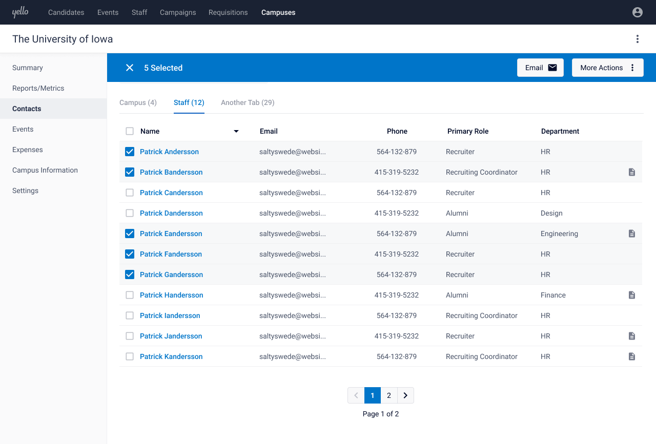
Campus Contacts in Context
Event Management
Part of Yello's product offering is an event management feature, which includes both recruiter-facing and candidate-facing pages.
Before:
After: